The art of COLOUR! Five beautiful books to have in your studio
It’s spring in the northern hemisphere and suddenly I’m seeing fresh colour everywhere! Like a huge breath of fresh air, it’s coming out in my art and the palettes I’m choosing. I’ve also been inspired to do some colour wheels (using warm and cool primaries). As an artist who loves colour, this is helpful to me in the way that practicing scales would be to a musician!
Today I’ll share with you the books I keep close to help me learn about colour: a couple of colour reference / resource books, and three more that highlight sublime talents for colour.

If you’re looking for practical exercises to understand colour
I’ve been geeking out this week with the help of the exercises in this wonderful book! Covering a diversity of topics - colour value, temperature, saturation, colour harmony, and colour psychology are a few - it offers a sequence of specially designed colour assignments to bridge the gap between color theory and practice. I dip in and out of this book as a reference as well.
Color: A workshop for artists and designers (Third edition), by David Hornung
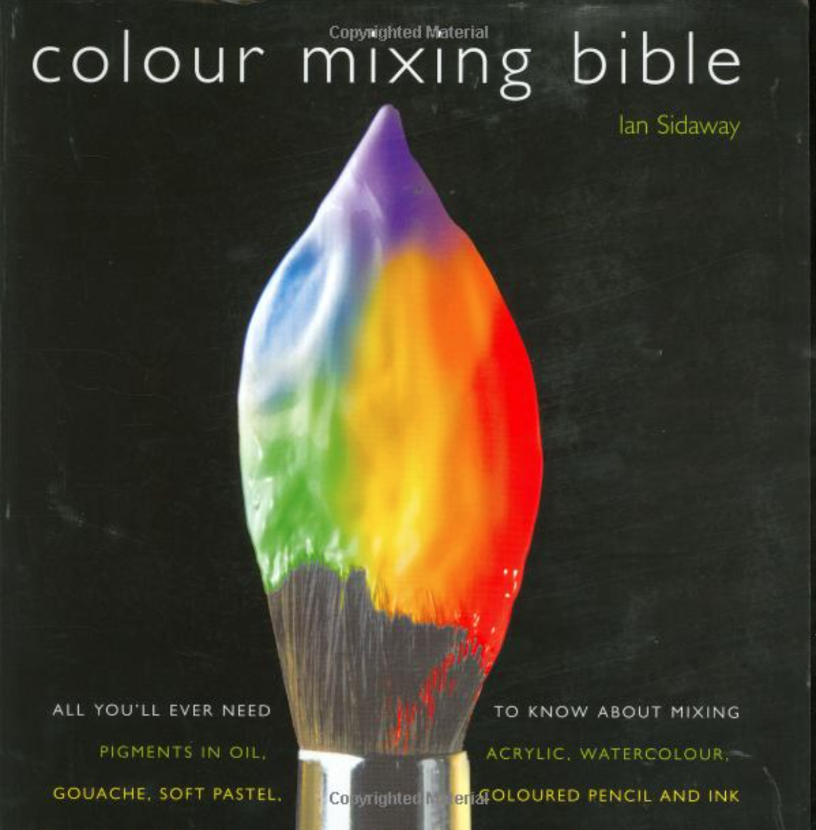
Mixed up about mixing?
Here’s another helpful reference I come back to regularly. This takes all the guesswork out of mixing and matching colors. The heart of it is a visual visual directory of colours and how they are achieved in two-, three-, and four-color mixes. I love that it has a separate directory for watercolour, acrylics, oils, soft pastels, guache, pencils and inks.
Color Mixing Bible: All You'll Ever Need to Know About Mixing Pigments in Oil, Acrylic, Watercolor, Gouache, Soft Pastel, Pencil, and Ink, by Ian Sidaway

Learning subtlety by example
I’ve learnt so much by studying the work of well-known artists. When it comes to colour, I have a few favorite books that I pore over, again and again, always seeing something new.
Matisse/Diebenkorn, Edited by Janet Bishop and Katherine Rothkopf, texts by John Elderfield and Jodi Roberts
This artbook is a “two-fer”, bringing together the work of Henri Matisse and Richard Diebenkorn, charting the evolution of Matisse’s impact on Diebenkorn over the course of Diebenkorn’s career in 80 gorgeous colour plates.
Both Matisse and Diebenkorn handled colour with extraordinary sensitivity. Just look at the blues on this cover!

Energy and emotion
I go to this book when I want to see colours zinging, jostling, cohabiting a small space uncomfortably, singing duets sublimely, tugging your emotions in every direction.
Rothko: The Color Field Paintings, by Christopher Rothko / Janet Bishop
While Rothko did not set out to explore colour interaction (he was more interested in using colour to express the range of human emotion), observing the effects of colours on each other is how I love to use this book.

Brave and innovative colour
The final book for this studio note on colour has to be about Frankenthaler. Her work always reminds me to push myself outside of my comfort zone with colour, to be brave and innovative.
Frankenthaler’s use of colour evolved dramatically over several decades and this book demonstrates a gamut of possibilities - from thin, almost transparent primary blotches against white, to highly saturated work, and then to thicker, modulated hues.
Imagining Landscapes: Paintings by Helen Frankenthaler, 1952–1976, by Robert Slifkin, Gene Baro, Sonya Rudikoff and Henry Geldzahler
That’s it for today - time to get outside and enjoy our spring colours. See you next month!